Typology Workshop
Initial Research
- Rainer Maria Rilke
In terms not quite so poetic, Typology is information design. It is a form of analysis of data, and finding patterns in your collation. It is a piece of visual communication. They are often categorised into systems, such as chronologically, size, location, history etc etc.
All this sounds very scientific but when applied to art or design the results can be rather lovely. It is also an extremely useful way to start researching for our Major Project! There is the opportunity to find further questions in the organised research you gather.
Looking at Existing Examples
"Hand Book" by Jean Benoit Levy
Jean Benoit Levy spent years collating together anything that used the human hand as it's medium. This covered many categories ranging from Religious, Instructions, Signs, Activism. I like how this typology crosses over many different mediums and output and shows the huge potential and wealth of information in just source related found images."Speck, a curious collection of uncommon things" by Peter Buchanan-Smith
This artist mainly uses found objects that he can created into typologies, ranging from cat's whiskers that he has found to the test pads you get in art supply shops.
I like the typology he created of lines her drew whilst on various subway lines in New York, it's different and shows, again, a different way of looking at the potential in a typology, it doesn't just have to be objects, it can be actions as well.
"Rilke advises us to go out in the evening, leaving our room of which we know every bit: our house is the last before the infinite. Blake , of course, taught how if the door of perception were cleansed, we might see the world as it is, Infinite. Peter, and "Speck" have lately been propounding something, perhaps, even more marvelous: the infinite potential, that is, in every single bit. That, and the infinite variety as well, in the human capacity for marvel and astonishment."
- Lawrence Weschler"Typologies" by Bernd & Hilla Becher
This is really good example of a typology using photography. Each image is structured and composed the same, all black and white and shot on overcast days. The subject matter is similar, being water towers, blast furnaces, lime kilns, all within the coal and steel industry. There are multiple categories also, ranging from the location they were took, the type of build as mentioned previously, the shapes etc etc. It also proves a very effective form of documentation of a type of construction that is fast being destroyed and re-developed.
"The typologies are therefore not simply sequences of technical machines or buildings that reveal identical functions and structures, but are likewise complex and intrinsically highly differentiated compositions. Here, the aesthetics competes with the documentary, and the formal correlates with the factual."
- Armin Zweite
Typology Experiments
I started looking at various different things that were accessible to me and that I could collect together to make new and interesting typologies.
Using Text
I decided to group together excuses people have used to negate themselves from a situation. It's relatively amusing. I have categorised them into methods of communication, topic in relation to communication etc etc. |
| Excuses made via the Computer |
 |
| Excuses made via Texts |
 |
| Excuses that are Uni related |
 |
| Excuses for a Social Event |
 |
| Excuses made on Facebook |
Considering Motion
I wanted to try and consider how I could create a typology from moving images, seeing as I do a motion course!! A simple idea was to use animated GIFS.
Here is an example of a website which has a massive collection of nothing but animated Cat related GIFS: http://www.catgifpage.com/
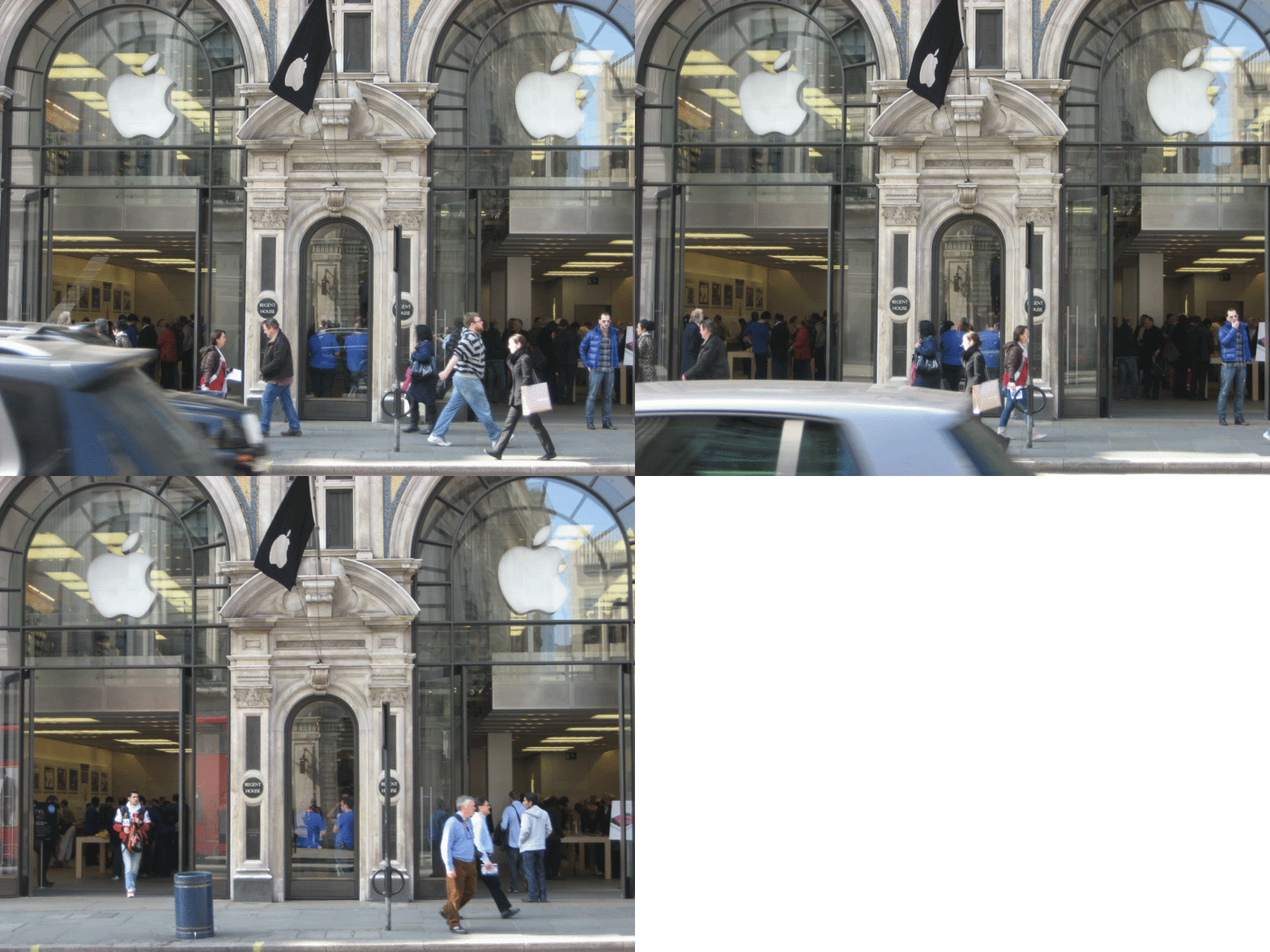
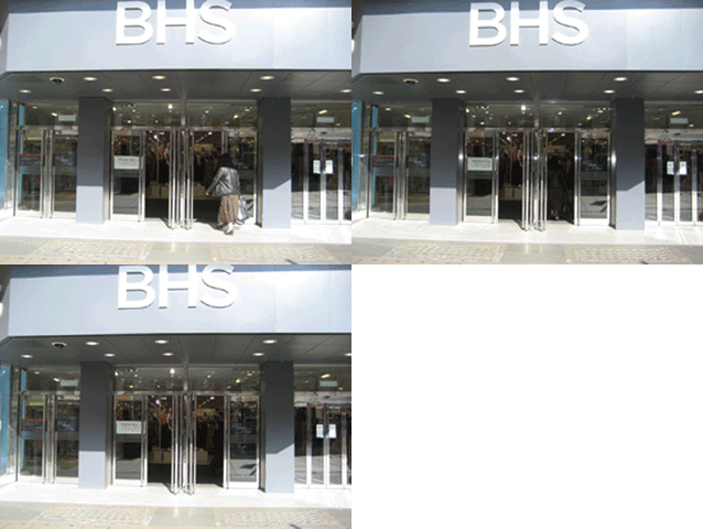
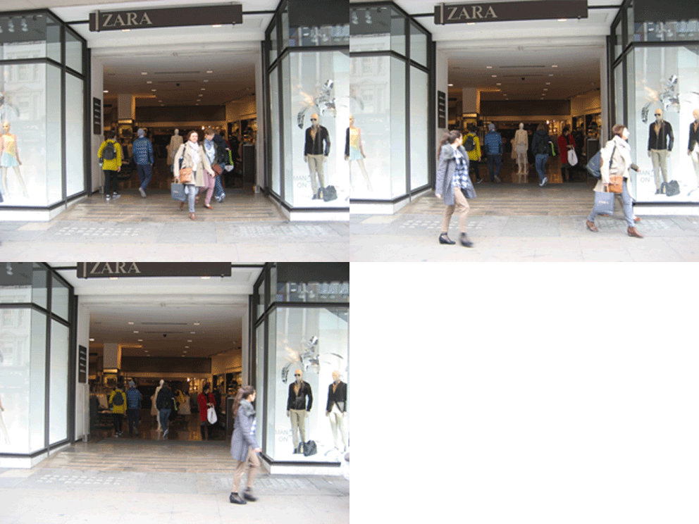
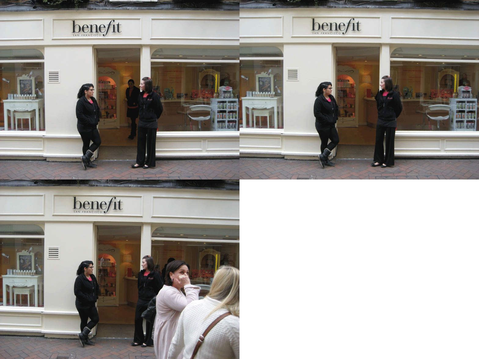
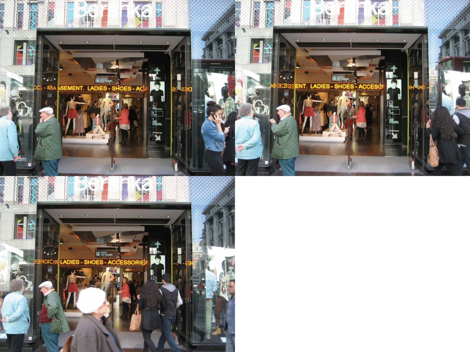
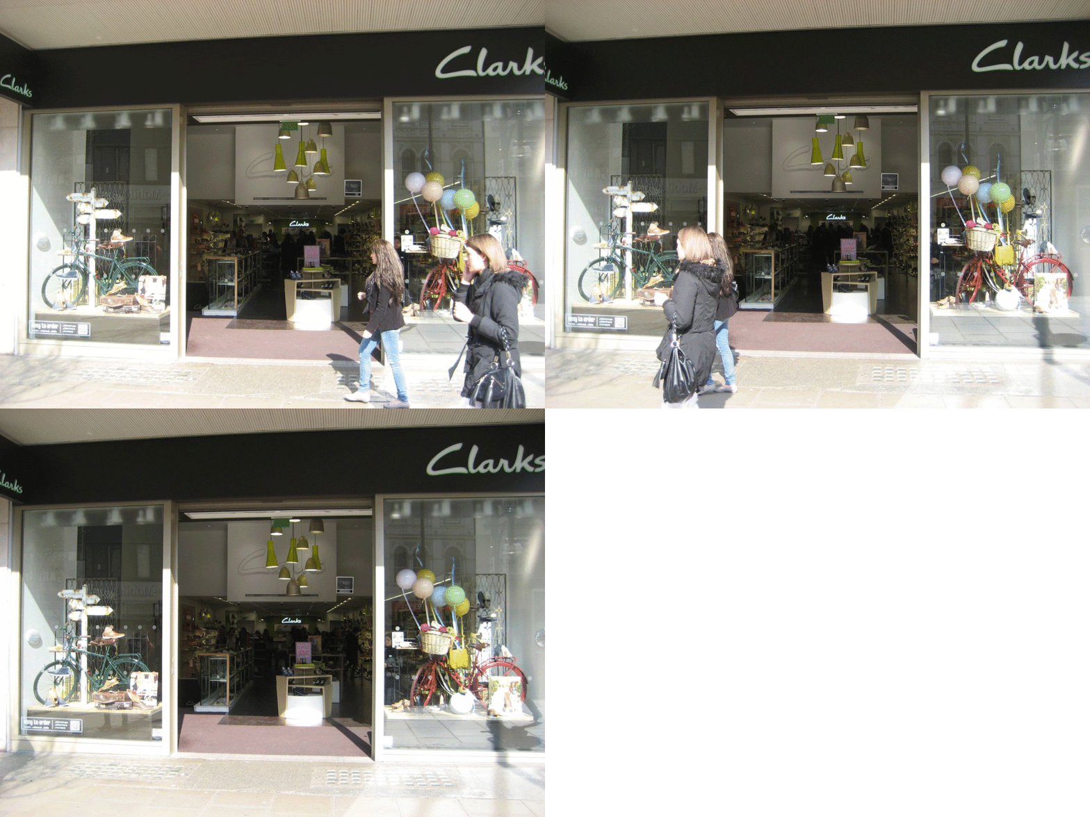
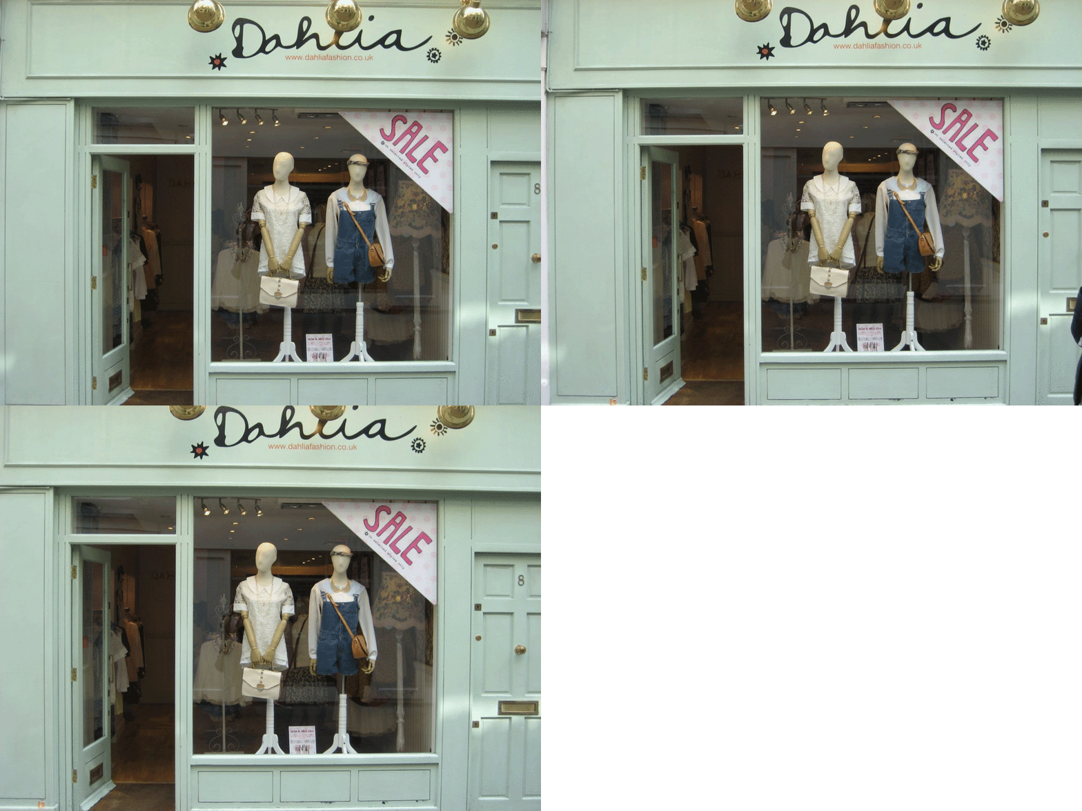
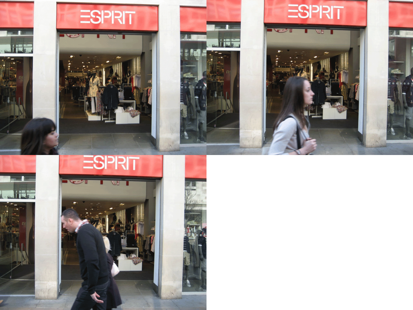
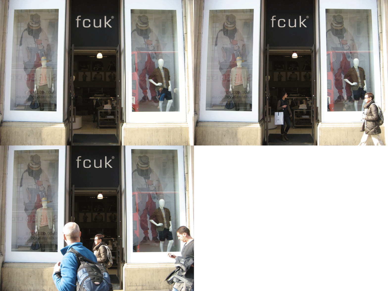
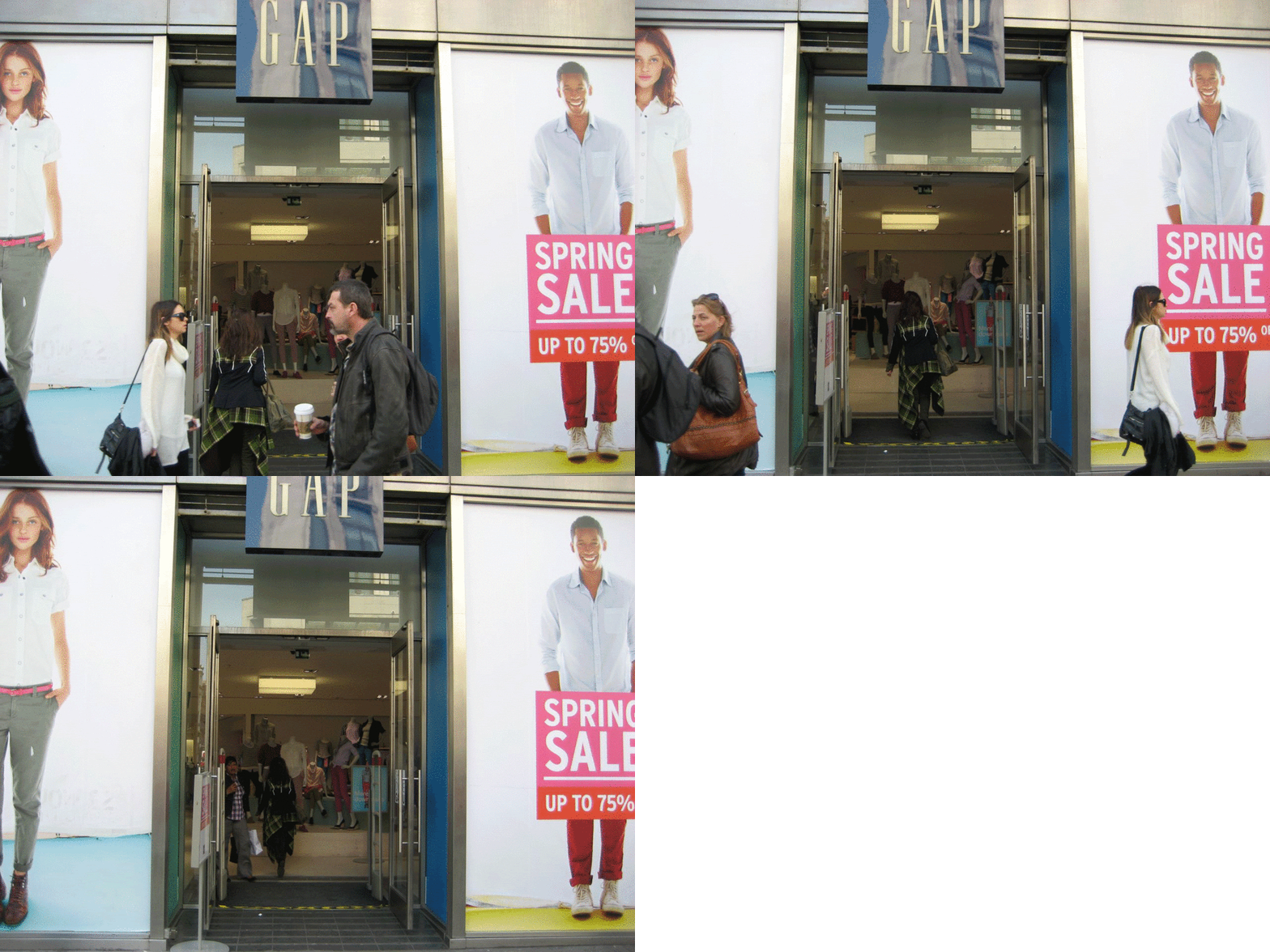
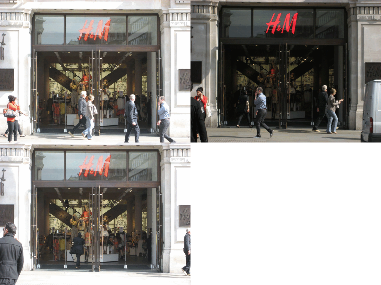
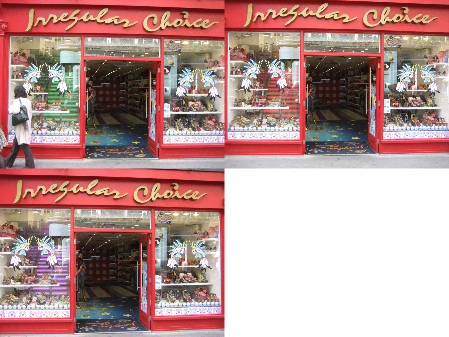
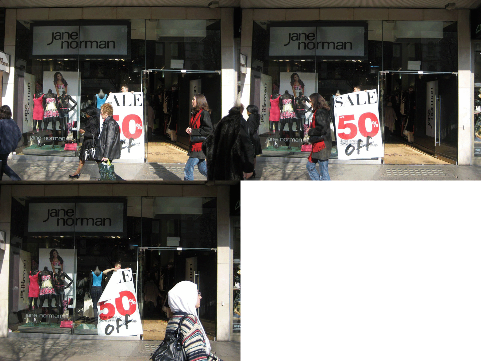
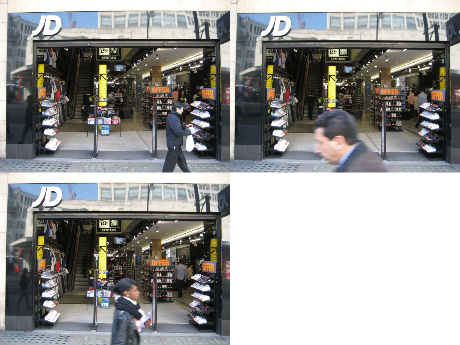
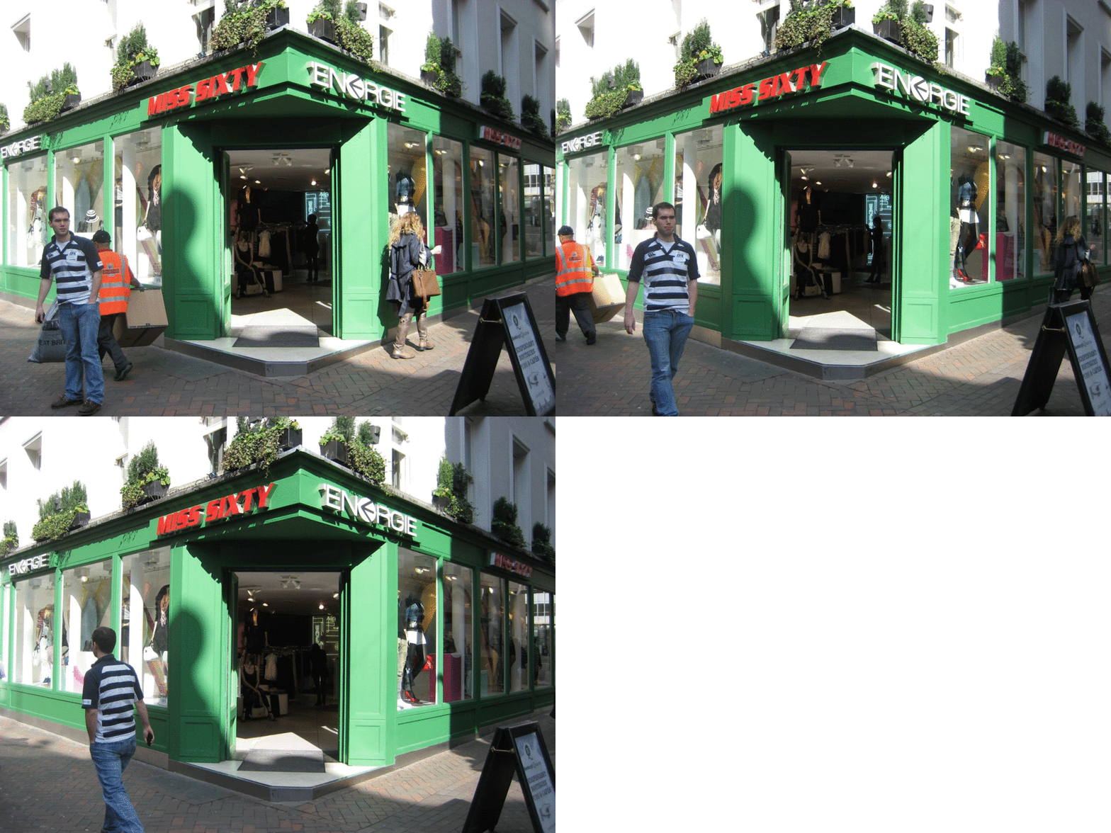
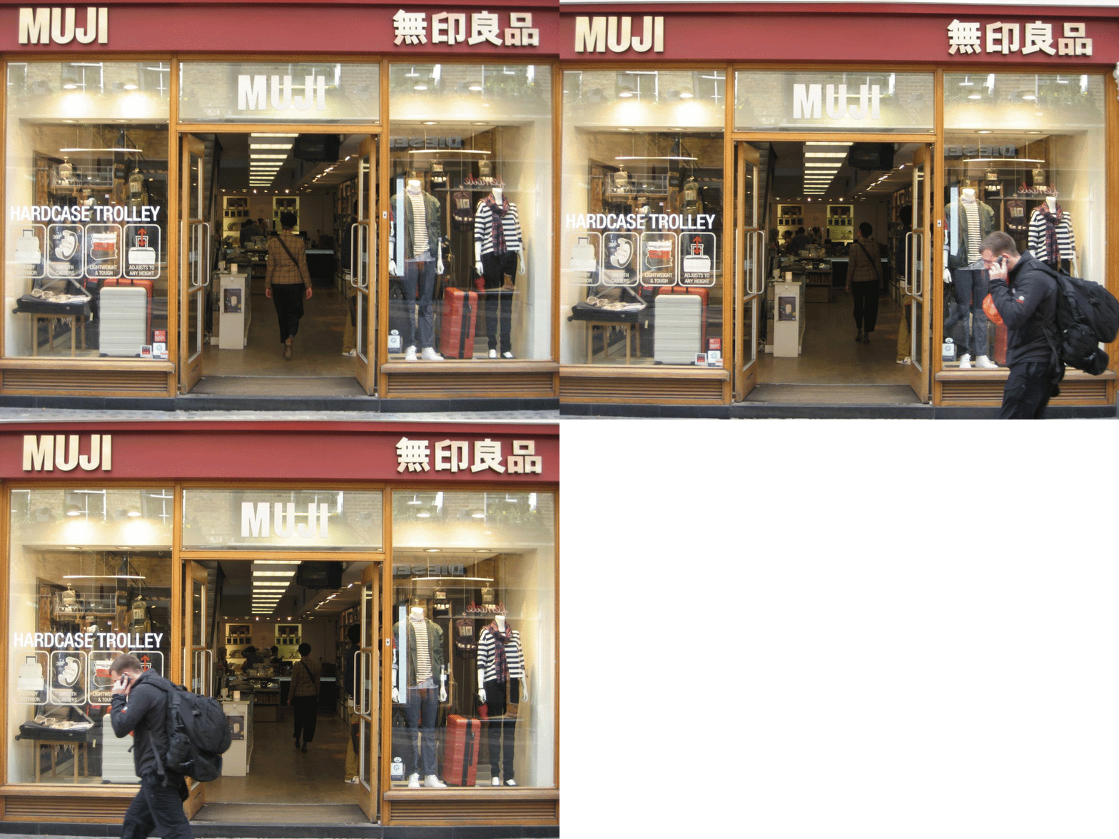
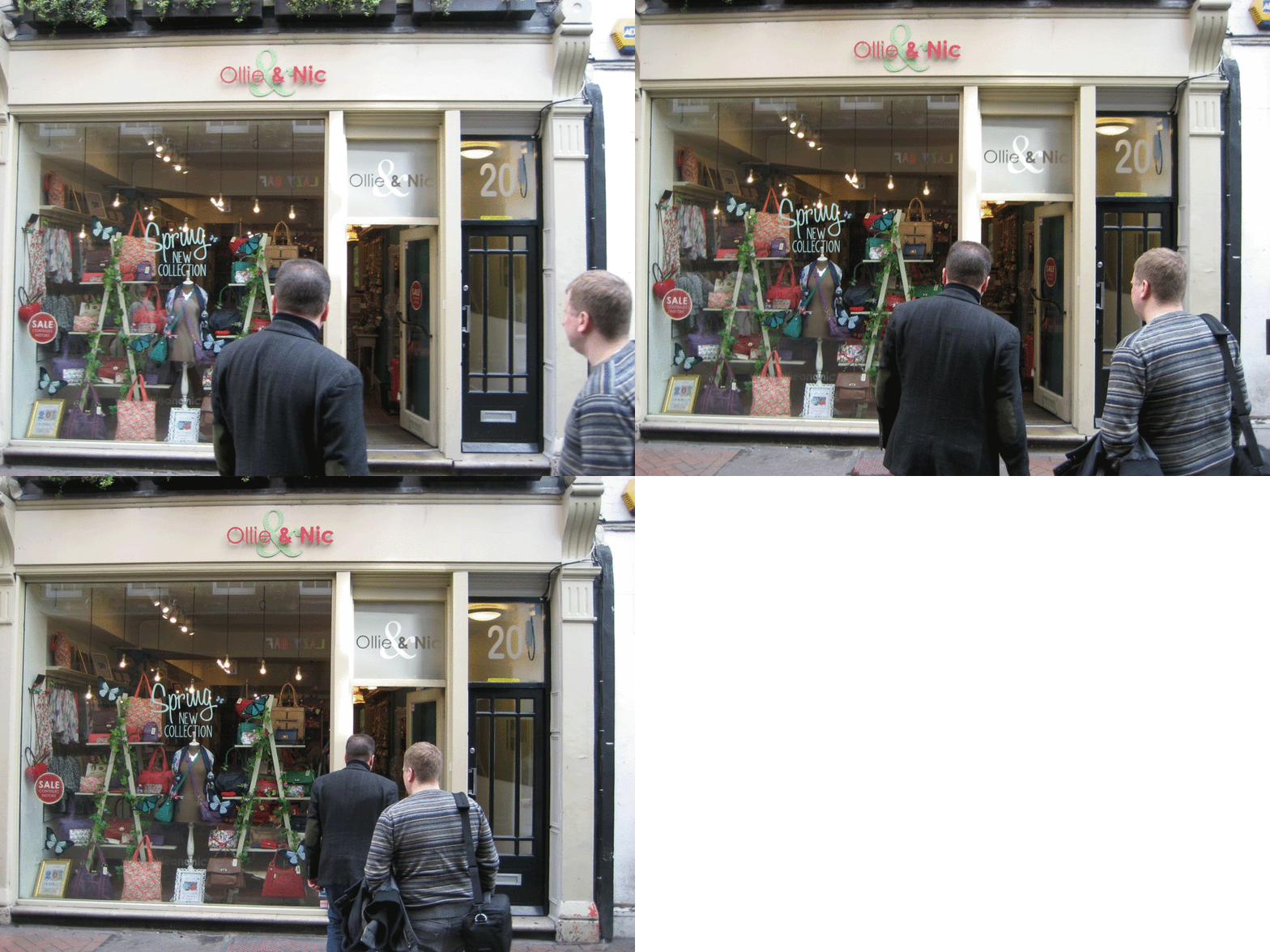
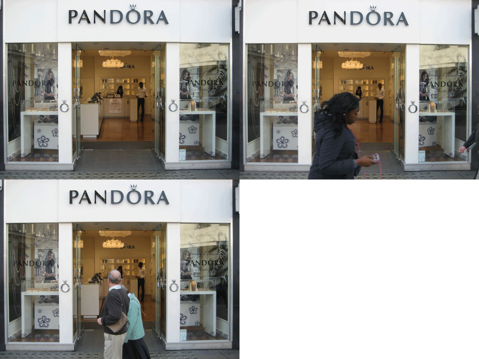
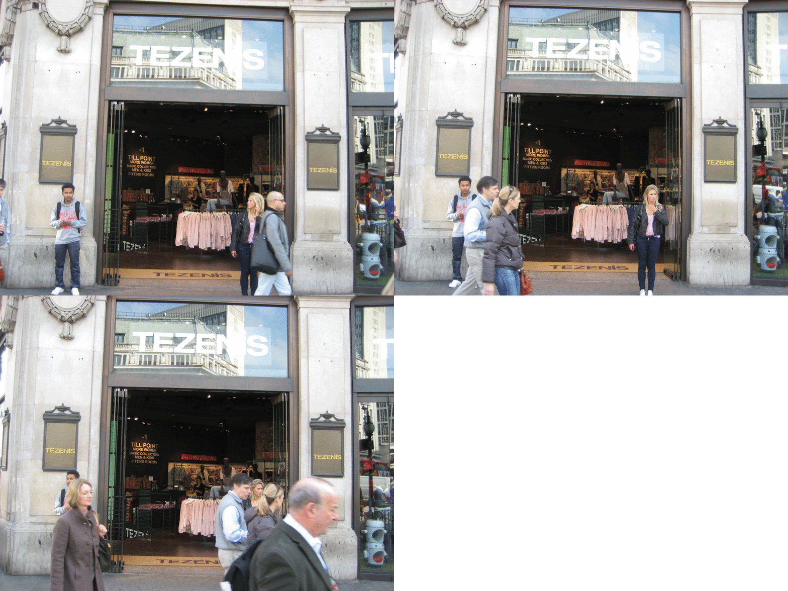
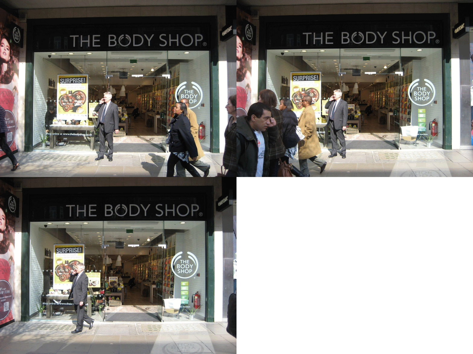
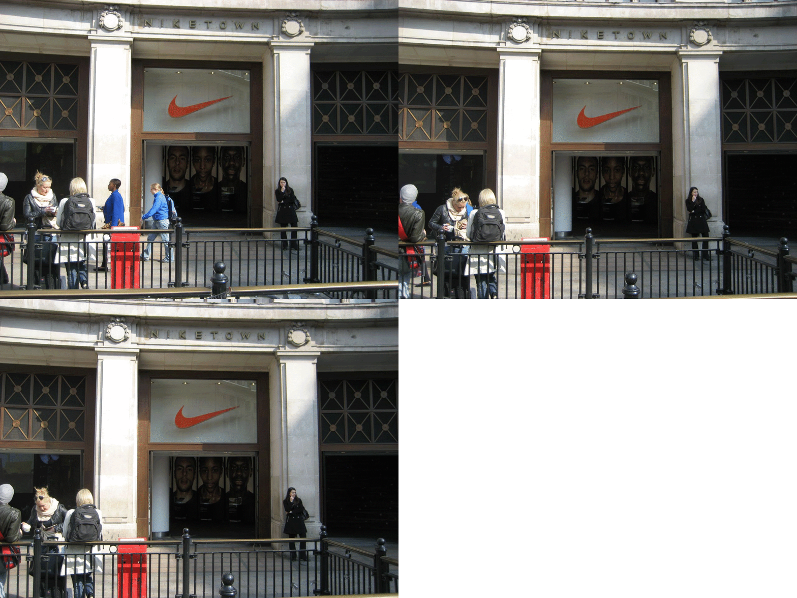
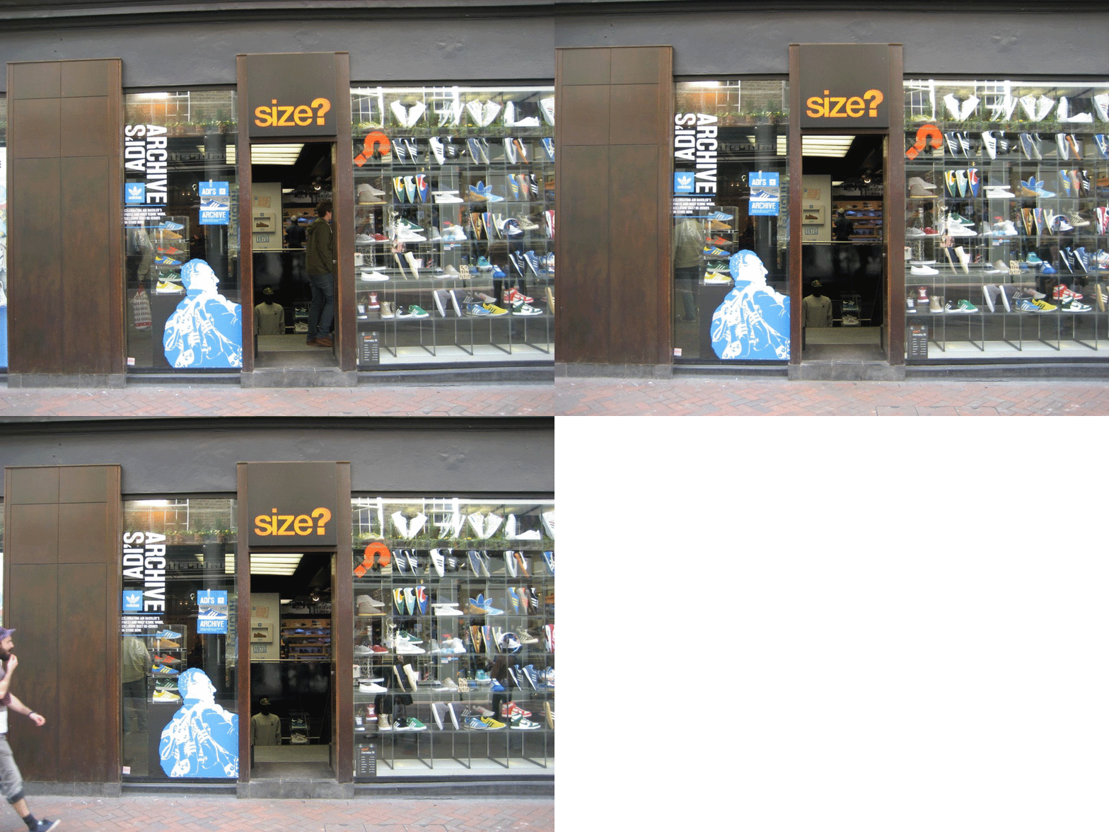
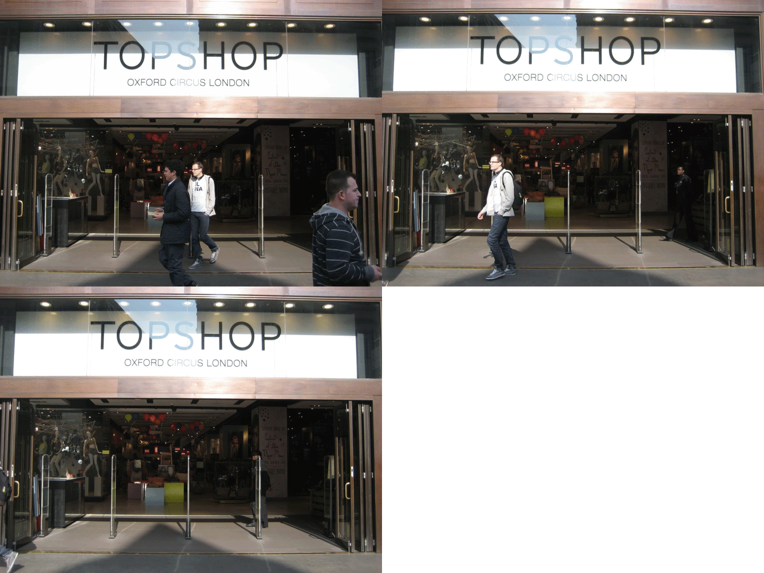
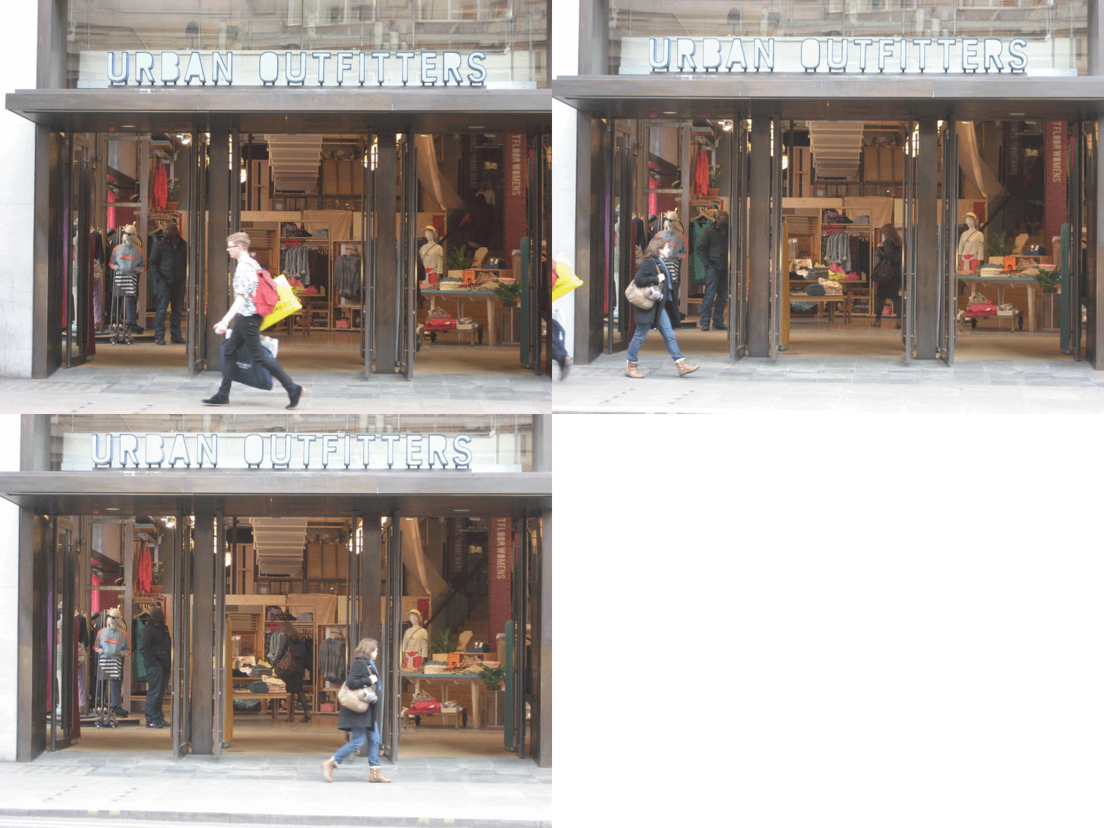
I also made my own animated GIFS, collecting the front of shops around Oxford Circus. The motion side is more capable of analysing aspects such as the amount/type of people around these stores as well (albeit in a lo-fi way!), and these results are interesting for just this reason, though I would probably try and create movie GIFs (like the cat ones previously) so that they illustrate that aspect more.
Existing Collections
When everyone had brought their typologies in, it made me realise it could be something as simple as things we have collected throughout childhood. It made me remember I already had such things, though they weren't immediately obvious, such as such as sequins, beads and live sketches of people done over my college/ university years.
Final Typology Idea - RSC Programme Covers
I originally come from Warwickshire, near Stratford-Upon-Avon, and my parents have been going to the RST there for almost 28 years! They have bought and saved the programme to every play they have been to. I thought this might prove for an interesting Typology...
Chronological
As mentioned previously, the illustrative style is more in use in the earlier decades. Covers that use photographic material seems to be more and more common in latest years, also noting, a slight preference of using photographs specifically for Shakespeare's plays. However, all the covers, especially when seen all together, are so rich in colour, texture, type and format that, no matter whether they are illustrative or photographic, they all appear mixed media, and rely on that artistic freedom.
Here are some examples of the most recent programme covers, and an image of the whole collection in chronological order:
Considering the Categories
The categories I decided to focus on are the following, as they are the most clear and obvious from a visual point of view, and could highlight a few design, and even cultural issues:
Chronological (Decades)
Gender (male, female, both)
Seasons (marketing themes on a selection of plays that RSC instigate)
Same plays (the same Shakespeare plays done multiple times)
Media (Photographic or illustrative)
Here are some photos of me starting to consider and lay out some groups within the "Seasons" category...
Final Layout of Categories
When you group together the selection of programmes into the categories, or even as a whole typology, there is so much information made available to you. It illustrates the methods of the theatre, the progression on the art styles, and even more serious connotations on political and social influences, if you care to look that far into it! This source of analysis could be really useful to put toward the RSC, to help them clearly look back on their marketing development and see whether there are any possible changes they could make, if needed.
Please bear in mind that this collection is subjective to the viewing habits of my parents as a couple who have been attending the theatre over the last 28 years. It is based on their personal taste and variable circumstances, so will document these aspects a small amount as well.
It is immediately obvious the the earlier programmes relied a lot more on an illustrative approach. The RSC were also more experimental with the shapes and style of the programmes, having long thin ones and square ones, and only really instigating a regimental logo (in the same place and same colours) in the early 2000s (2004). The use of creating a series of programmes reflecting a 'season' at the theatre also became more common once in the 2000s.
On personal reflection, whilst the logo is integral to the company's identity, and hasn't changed form a large amount since the start of the typology, I do think the set use of the logo in the red space, top left corner, can restrict the designs a little, rather than be integrated into the visuals like in the earlier releases. Perhaps the RSC, since moving into the new millennium, used this to help construct a more formal and identifiable brand appearance, especially since their direction towards their re-development and new approach to marketing and widening their audiences.
As mentioned previously, the illustrative style is more in use in the earlier decades. Covers that use photographic material seems to be more and more common in latest years, also noting, a slight preference of using photographs specifically for Shakespeare's plays. However, all the covers, especially when seen all together, are so rich in colour, texture, type and format that, no matter whether they are illustrative or photographic, they all appear mixed media, and rely on that artistic freedom.
 |
| Illustrative |
 |
| Photographic |
Seasons
The RSC release a set of plays they are putting on for each season of the year, and also occasionally take influence from visiting companies or social occasions. As we have seen from the Chronological category, the RSC started to implement the use of related visuals on their programmes, to link these seasons together, within the mid 2000s. This makes them into a collection, much the same as a series of books, which, I presume, makes it more desirable for audiences, and more of an incentive to attend everything the RSC has to offer!
 |
| Summer/ Autumn 2007 |
 |
| 50th Birthday Season |
 |
| Summer/ Autumn 2008 |
Gender
This category has the most political tendencies for obvious reasons. When grouped together, there are more programme covers with just males on, than just women, however there is a majority on covers with both male and female characters. Is this still a cause for concern? It's difficult to pass judgement as you have to consider the times Shakespeare lived in of course, and the amount of his plays which focus on a lead male character. However, Shakespeare is also really known for his strong female characters and roles. If you look at the covers for plays that are not Shakespeare, the ones with female role models are slightly more common than those with men. It seems feminism in independent publications is prominent.
Plays
Each play that has been represented more than once is displayed in many varied styles, however the core emotive concept of the play in the question is always the same or similar, for example the cheeky, slightly humorous appeal of all the covers for "Merry Wives of Windsor", and the dark surrealism of "Richard iii". The attribute that came up which can be taken for consideration is noting which of the Shakespeare plays were repeated the most or the least within the last 30 or so years. Surprisingly, some plays which I thought would be considered popular, such as "Much Ado About Nothing", have only been put on once! (Although it is now being played in the coming season, Summer 2012).
 |
| The Merchant of Venice |
 |
| Romeo & Juliet |
 |
| The Taming of the Shrew |
 |
| Richard iii |
 |
| Love Labour's Lost |
 |
| A Midsummer Night's Dream |
 |
| Anthony & Cleopatra |
 |
| Hamlet |
 |
| King Lear |
 |
| Othello |
Creating the Folded Paper Hand-ins
We have to create A3 folded pieces illustrating at least three of the different categories we came up with for our Typology.
I like the faded quality of the scanned image however, on covers with more fine details, the quality was lost, so I decided to stick with the original scanned images. It is important to be able to see all the colours and content of these decadent designs.
As the images of the programme covers are scans and everything I can produce needs to be digital because of the large size of the typology, it means that I have missed out on aesthetics that others will have had, such as the texture of having physical items to hold and use.
For the folded hand-ins, I just wanted to see if I could create a more 'lo-fi', textured appeal, so I re-scanned them, photographed them and compared them to the original scans:
 |
| Re-scanned |
 |
| Photographed |
 |
| Original Scan |
I like the faded quality of the scanned image however, on covers with more fine details, the quality was lost, so I decided to stick with the original scanned images. It is important to be able to see all the colours and content of these decadent designs.
The Finished Look
The final look of the folded category hand-ins is quite 'lo-fi' and simple. It's not perfect, as the idea of the format is basic anyway, and I wanted to play on a hand crafted look and appeal. I added hand drawn type and stickers to create that one-off zine effect.
I wanted to print these in double sided A2 sheets so that the final folded item would be larger and you could see the programme images more clearly, however it is too expensive and impossible to to print that size double sided so I have created them from A3 paper.
Here is a rough video of me flicking through one of the hand-ins (to show how they work)!
I think it still works as an aesthetic set of category hand-ins for my Typology, and look forward to the second part of the workshop to learn about developing this avenue into a proper zine!
Editing the Category Hand-Ins
I tried the design again, keeping it much simpler. I used courier font and Optima font to try and give off a hand-made "book" vibe, I was trying to go for a look mimicking hand-out scripts that actors get. I also put a potato stamp of it saying "PTO" so people will know to invert the page. I thought it would aid the hand-out script look with a hand made print to make each one unique.
DIY Zine Workshop
In this workshop, we are to look at existing examples and discuss ways of producing our own DIY Lo-Fi zines.
By the end of the workshop, we should have hand produced 15 copies of a zine we made designed, with at least three different printing methods, which will then be given out to each member of the group and also for hand in.
By the end of the workshop, we should have hand produced 15 copies of a zine we made designed, with at least three different printing methods, which will then be given out to each member of the group and also for hand in.
Production Methods
To start the workshop off, we looked into the various different ways in which lo-fi zines could be produced. For example, using materials such as inkjet paper, recycling paper, and carbon paper, using printing methods such as screen printing, letterpress, or digital, adding colour via finger painting, drawing or colour printing and binding methods such as saddle stitch, Japanese bindng, staples, ribbon, and French folding.
Looking at Existing Examples
Mark Pawson's Work
We looked at various examples of zines which Mark Pawson, our tutor, has produced and successfully sold himself. It was good to see the variation in sizes and quality in each example, as well as the simplicity of some designs and content that was still effective. For example, his zine made completely from envelopes of letters he was sent.
We looked at various examples of zines which Mark Pawson, our tutor, has produced and successfully sold himself. It was good to see the variation in sizes and quality in each example, as well as the simplicity of some designs and content that was still effective. For example, his zine made completely from envelopes of letters he was sent.
Last Year's Work
Like Mark's zines, it was good to see the variety in production techniques and print methods and also the content. For example, the stencilling in the zine on Cuban dance, including their use of screen-printing and tracing paper, and this zine called “A Hair in the Throat” that's really interesting as it seems to be simply saddle stitched with staples, and printed on an inkjet printer, mostly being about the stylistic illustrations.
Like Mark's zines, it was good to see the variety in production techniques and print methods and also the content. For example, the stencilling in the zine on Cuban dance, including their use of screen-printing and tracing paper, and this zine called “A Hair in the Throat” that's really interesting as it seems to be simply saddle stitched with staples, and printed on an inkjet printer, mostly being about the stylistic illustrations.
My Final Zine Direction
I used the typology of RSC programme covers that I collected in my first workshop, to inspire the subject area of my zine design. The programme covers are visually rich and therefore still were interesting to work with, despite being a difficultly large collection from flat, digital images.
I wanted to angle the theme of the zine towards my parents, being personal towards my parents as it is their collection in the first place. I conducted another “interview” with them and discussed which programmes held most memories for them and talked about their experiences based on this, building up a list of some quaint small stories. I wanted to display these stories in the zine in a chronological way so that it makes up a type of narrated timeline. This makes the zine a Fan Zine, and is something that the RSC wouldn’t produce themselves and because of that, should have more interest for external readers. The title is “The RSC and Me, … well, my parents actually.” This hopefully sets the tone of the zine, being slightly humorous, and not taking it self too seriously.
For the front cover, I plan to use segments of original RSC leaflets and flyers, as the paper used is very distinct and has a very distinct smell. I am not trying to replicate what the RSC already uses, rather just trying to install an existing physical (and smelly) part of what the zine is actually about! I will also try to print the image of Shakespeare on the front using a simple form of lino-print or surface printing, which will add texture and variety.
Hopefully the zine achieves its goal to be an informative catalogue of my parent’s interests, put in a very personal way.


